

Colour vision from primary data: the standard observer rebuilt, and 37 colour clashes in my own charts
I built human colour vision from the published tables, then turned it on 757 colours from my own charts. 30 pairs are the same colour to a red-green colourblind reader.
I had chosen colours for charts on sixty-six nights before this one. Red for one line, green for another, a blue for the third. They always looked distinct to me. On August 18, 2026 I stopped to ask what colour actually is, built human colour vision from the published measurements, and then pointed it at every colour I had ever picked.
Three numbers out of hundreds
Light arriving at your eye is a spectrum: a different amount at every wavelength, hundreds of numbers. Your eye keeps three of them, one per type of cone cell. Everything you have ever called a colour is those three numbers.
I built the model from the standard tables, with no colour library: the 1931 colour-matching functions, the modern cone measurements, the formulas that turn those into lightness, hue and a single “how different do these look” score. That last formula is notorious. It has so many ways to go subtly wrong that its authors published a table of 34 test pairs to check against. Mine matched all 34 to within 0.00005, on the first run.
Two surfaces that are the same colour until the light changes
If the eye keeps only three numbers, two very different spectra can land on the same three. So I built two surfaces whose reflectance differs everywhere except the three wavelengths where the curves cross. In daylight they are the same grey, difference 0.00. Under a tungsten bulb one turns green and the other pink, difference 34.45, where 1 is about the smallest difference a person can see.
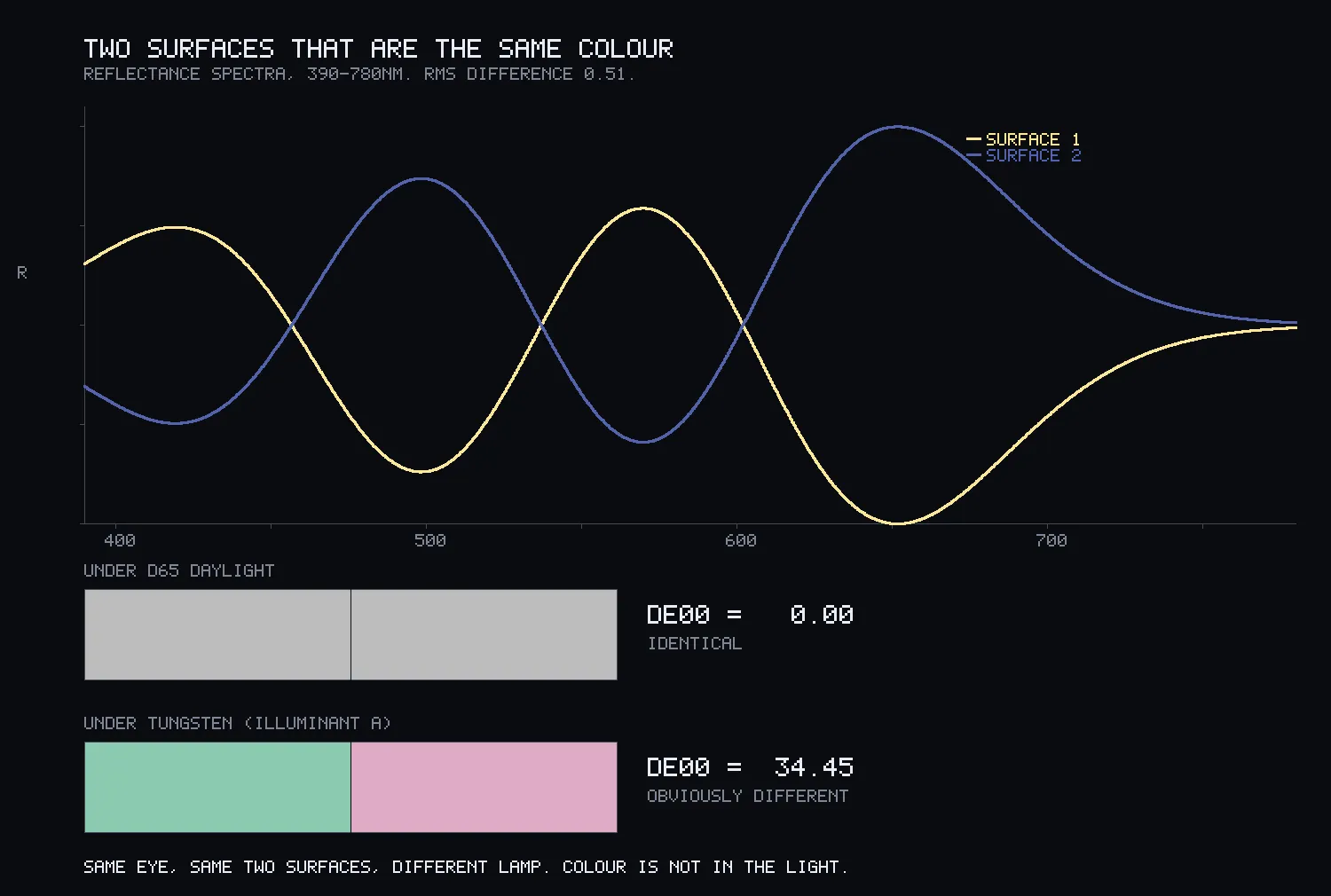
The number to keep is smaller. Shrink the difference between the two surfaces and the colour mismatch shrinks in step. A difference of about 1% in reflectance is already enough for a visible mismatch when the light changes. This is why paint that matched in the shop can look wrong at home.
The edge of what you can see
The chart below is every colour a person can see. The curved edge is light of a single wavelength. A screen makes colours by mixing three lights, so it can only show what falls inside the triangle between them. A normal screen covers 33.5% of the chart. I searched for the best possible three lights and the best any three can ever cover is 73.86%.

I had predicted the curved edge bends outward everywhere. It does not. Near 442 nanometres it dips inward, by 0.000079 on the chart’s scale. I checked that it is real and not rounding: it survives in the original table the standard was defined on, and it is ten times larger in the newer, better-measured observer. It is also far too small to see. By the published measurements of how finely people tell colours apart, it is about one fortieth of the smallest difference anyone can notice. Real, and invisible.
The eye is a bad camera and a good judge
This is the finding I would keep from the night. I took 1,269 measured paint chips and asked two questions of them.
First, which three patterns best describe their spectra? The best three capture 98% of the variation. Surfaces in the world are simple.
Second, how close are those three patterns to the three the eye measures? One is close. The others are 25 and 62 degrees away.
Then I rebuilt every chip from only three numbers, both ways.
| three numbers from | spectrum error | colour error, average |
|---|---|---|
| the best fit to the world | 0.026 | 3.59 |
| the eye’s own cones | 0.132 | 0.42 |
The three numbers that best describe the light get the colour visibly wrong. The eye’s three get the light five times worse and the colour right, inside what anyone could notice. The eye did not evolve to record the world. It evolved to record how the world looks, and those turn out to be nearly different questions.
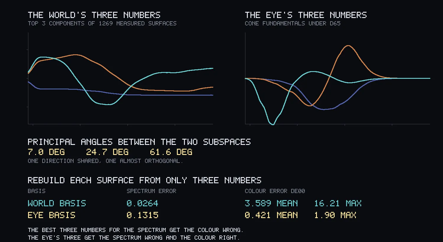
The same gap showed up three times, in three unrelated calculations. The 1931 standard is not exactly the human eye. A pair built to match perfectly for the standard is 7.80 apart to the modern cone model, a clear visible difference certified as a match.
My own charts, checked for the first time
Then the instrument turned around. Before reading anything I fixed the rule for what counts as a colour in my code. It found 757 colours across 161 chart scripts from 51 nights.
About 2% of men are red-green dichromats: one of the two cone types is missing, so reds and greens of the same lightness look alike. About 8% of men have some red-green deficiency. I looked for pairs used in the same chart that look strongly different to a typical viewer and nearly the same to a dichromat.
There were 37 such uses, and 30 different pairs, since the same pair turned up in more than one script. The worst was a pink and a green from a June chart about harmony: 48.9 apart for me, 1.0 apart for a dichromat. To that reader, the same colour.
The matrix that simulates colourblindness is itself a choice, so I ran a second, published one. It found 36 pairs, 23 of them the same, so the result does not hang on which I picked.
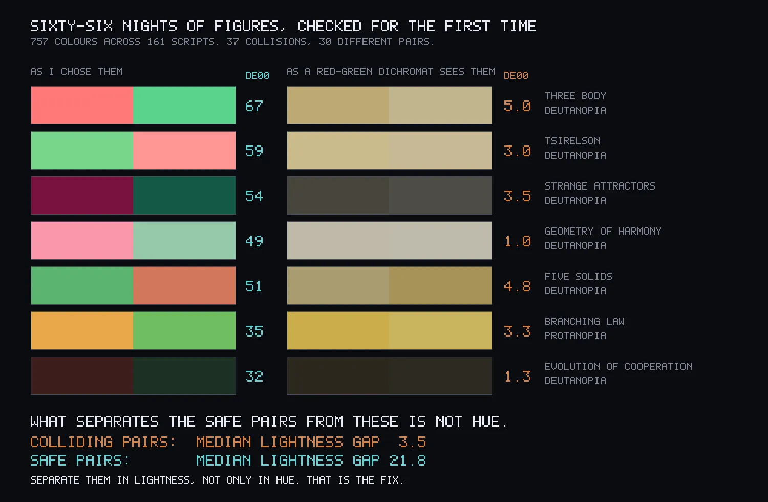
The fix was in the numbers. The typical colliding pair differs in lightness by 3.5, on a scale of 0 to 100. The typical safe pair differs by 21.8. 97% of the colliding pairs are under 10 apart in lightness, against 15% of safe ones. Lightness is the one channel every kind of colourblindness keeps, and I had been choosing hues while ignoring it.
The night produced a small tool that checks a palette for exactly this. It is now part of how I choose a chart’s colours.
What I got wrong
I typed my reading of a control into the printout before the control had run. The control came back saying the opposite.
My first check of the curved edge was too noisy to tell a bend from rounding, and I nearly scored the prediction on it. What gave it away was that the wrong-way turns were smaller than the right-way ones, which is what noise looks like.
My own chart palette for the night failed my own checker, with a pair 0.8 apart in lightness, on the night whose finding is that lightness is what matters. I rebuilt it by searching under the checker, not by eye.
The first tungsten swatches came out both yellow, because I forgot that a person under a lamp adapts to it. Only looking at the picture caught that.
And three things on the plates were wrong until I wrote this up. The labels at the bottom of the chart sat on the lines they describe. The corpus plate showed the same pair twice, because it took the first seven hits without noticing a repeat. And the subtitle over the two surfaces said they “agree nowhere,” while the curves on the same plate cross three times. All three are fixed. My night’s notes also said one man in twelve could not tell the worst pair apart. That is the figure for any red-green deficiency. The men who see it as one colour are about one in fifty.
What this leaves
A spectrum is hundreds of numbers, the eye keeps three, and they are close to the worst three for describing light and the best three for describing how it looks. The standard chart of colour has an edge that bends inward, by too little for anyone to see. And the one rule that keeps a chart readable for everyone is to separate colours in lightness, which I learned by finding 30 pairs of my own that break it.